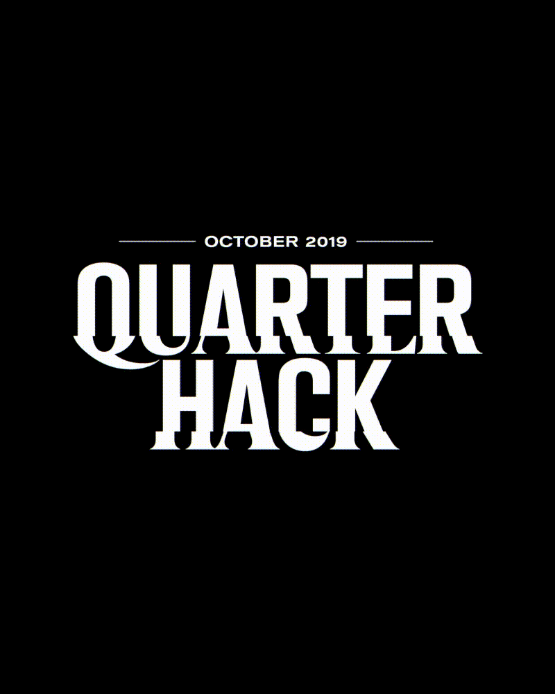
Quarter Hack Event Branding
Event identity design for Digital Surgeons’s 3rd quarterly hackathon.
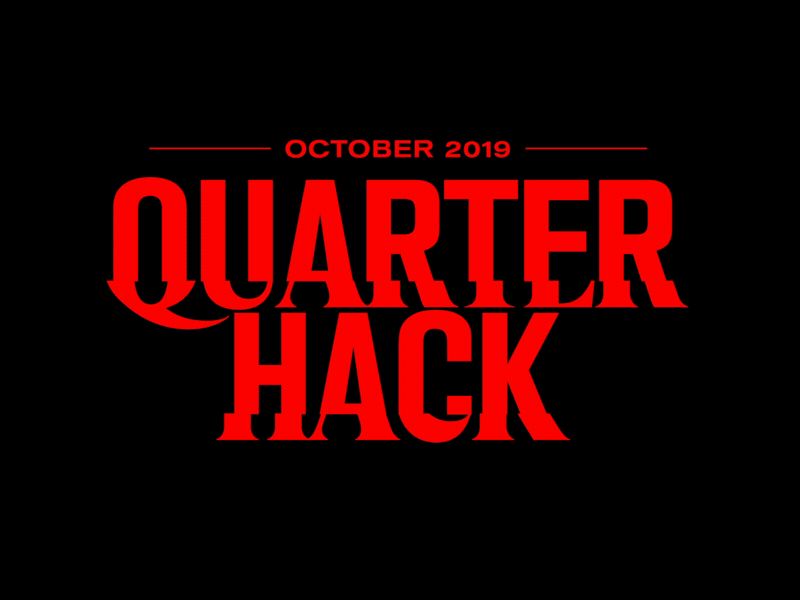
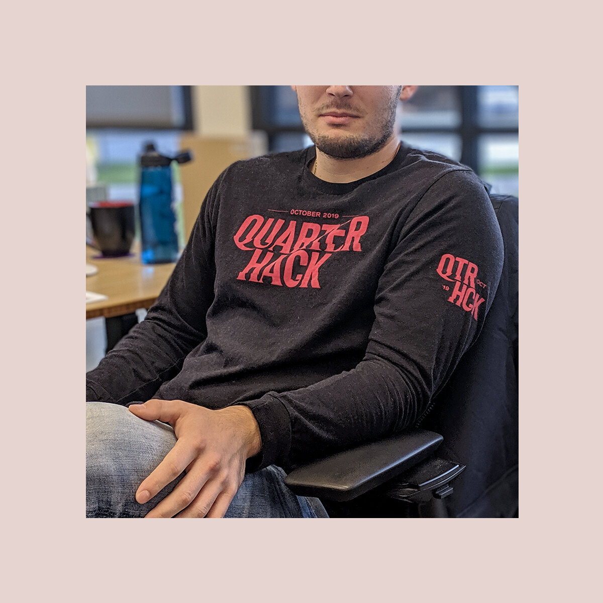
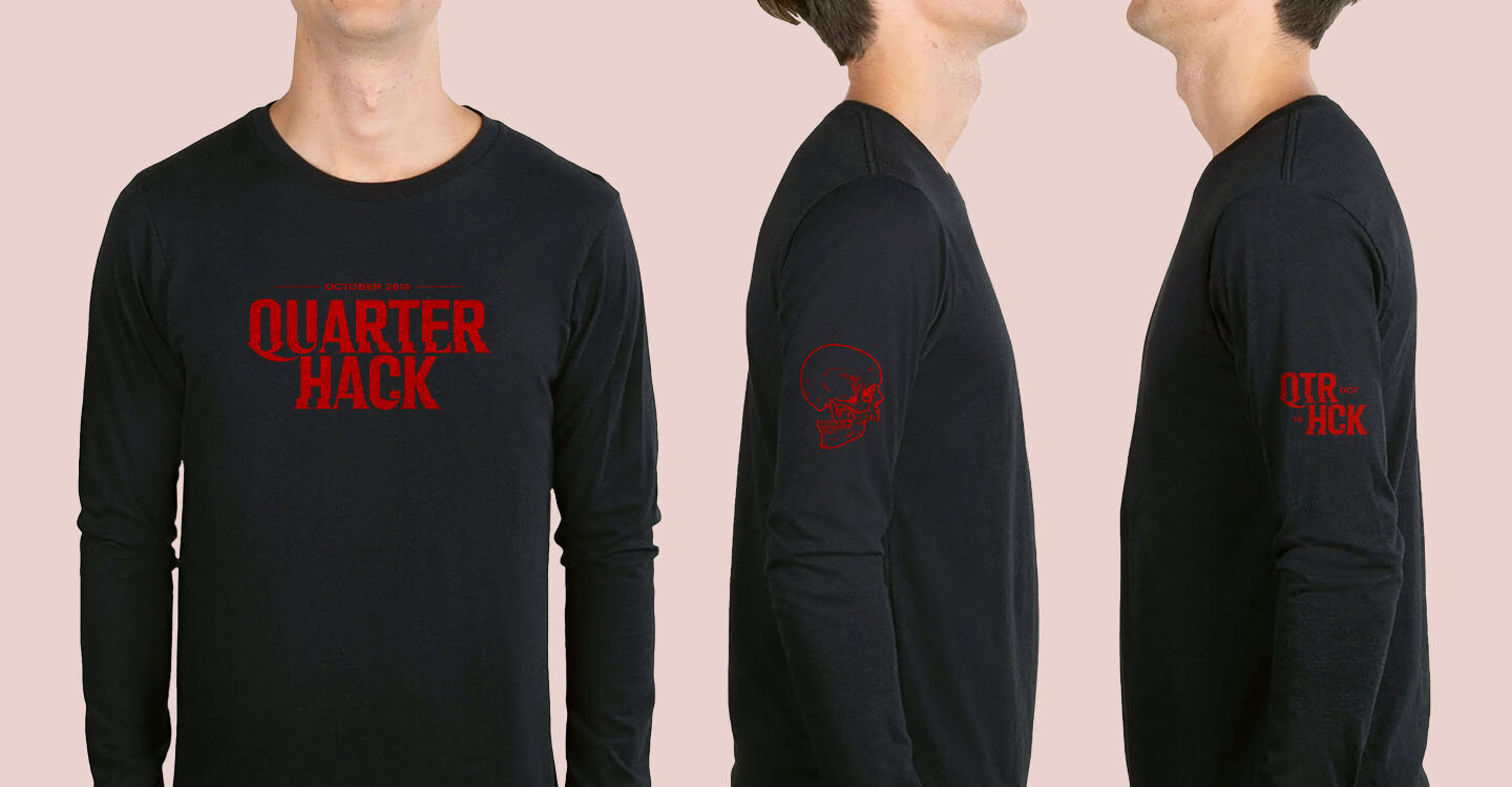
Because the event fell near Halloween, this wordmark borrows inspiration from old television glitches, and can be compared to the likeness of the Stranger Things identity.
By horizontally splicing and then combining a serif and sans-serif font, I invite an unsettling energy into the wordmark, while at the same time representing the different minds collaborating throughout the event.
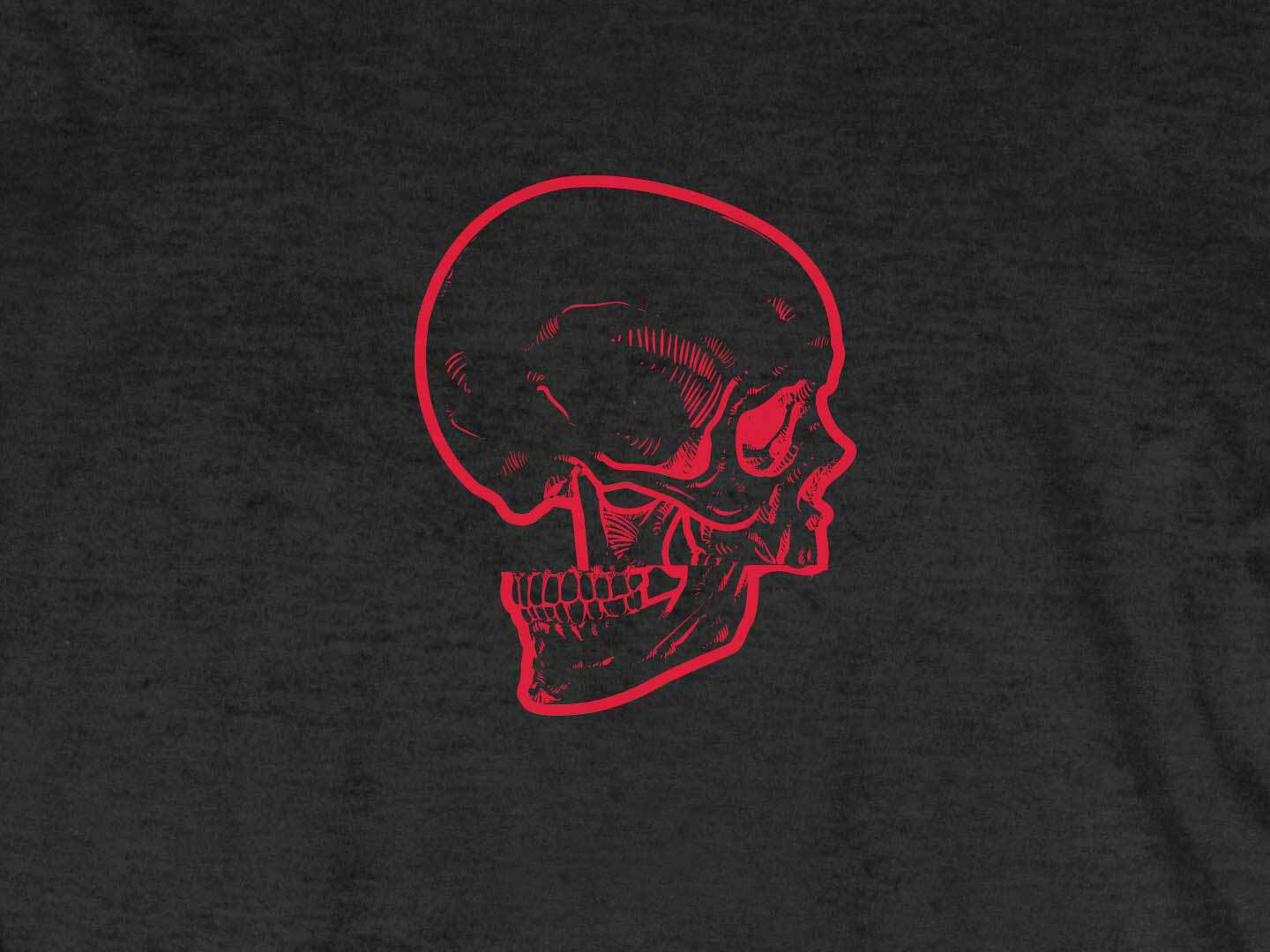
The end result is a Frankenstein font with eerily scythe-like accents, completed by an accompanying skull graphic that takes on the same visual style.
2019